|
The modern camera equipment will do a lot for you. It will choose exposure, depth of field, shutter speed, white balance, and focus if you allow it, but one thing your camera cannot do is compose your image. Composition is the way the elements are arranged in your image and is probably the most important element of any photograph. This post will guide you through 19 different compositional rules that will improve your photographic results!
|
|
1. Rule of thirds
The idea behind the rule of thirds is to break the image into thirds, horizontally and vertically, so there are nine parts. The theory is that if you place points of interest in the intersections or along the lines, your photo will be more balanced. When viewing images, peoples eyes naturally go to one of the intersection points, making this compositional rule a reliable option if you want to please the viewers eye.
 
|
|
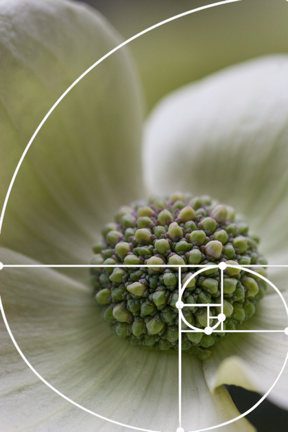
2. Golden Ratio
The Golden Ratio is a mathematical ratio and is often referred to as the golden mean, golden section, phi, and uses the Fibonacci formula. This particular composition is commonly found in nature and when used, produces compositions that are aesthetically pleasing to the eye.
 
|
|
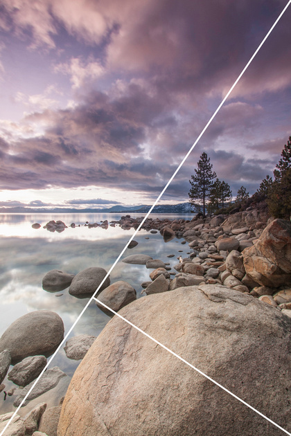
3. Golden Triangle
The Golden Triangle is made up of one large triangle and two smaller ones. If you occupy any one of these three triangles with content when composing, you will create a visually pleasing photograph.
 
|
|
4. Rule of Odds
The Rule of Odds suggests using an odd number of elements in your photograph to create balance and harmony. Groupings of three or more odd numbers of elements in a photo to provide balance, where even numbers of elements can create competition that is less pleasing to the viewer.
 
|
|
5. Negative Space
Negative space is the area between and around objects in a photo. Negative space emphasizes the main subject of a photo, drawing the viewers eye to it. It provides space, giving the viewers eyes somewhere to rest and preventing the image from appearing too cluttered.
 
|
|
6. Fill the Frame
This is somewhat the opposite of using negative space, but is about getting closer, to make your subject a significant portion of the final composition. If your subject extends beyond the bounds of the photograph, then you know you are truly beginning to fill the frame.
 
|
|
7. Simplicity
Simplicity is about placing the subject against a neutral background, which can be intentionally unfocused by using shallow depth of field. It should be clear that the subject is the reason for taking the picture. This can be achieved by eliminating any unimportant elements, such as lines or objects that lead the eye away from the subject.
 
|
|
8. Balance
There are two types of balance: symmetrical and asymmetrical. Symmetrical is when identical or similar subjects are repeated symmetrical on each sides of a given point. Asymmetrical balance is when one or more dissimilar elements are balancing on each side of a given point. Informal balance is less obvious because the subjects are not uniform.
 
|
|
9. Leading Lines
Leading lines is a technique of composition where you use lines that lead to the main subject of the image. A leading line provides a path for the eye to follow. These typically start at the bottom of the frame and guide the eye upwards and inwards, from the foreground of the image to the background, typically leading toward the main subject.
 
|
|
10. Patterns
Patterns appear whenever strong graphic elements are repeated. You can emphasize patterns by isolating them from their surroundings, creating the illusion that the repetition is infinite.
 
|
|
11. Color
Color determines the emotional content of a photograph. Cool tones can express calm, tranquility, or peace, whereas warm tones can invoke feelings of happiness, excitement and optimism. A spot of color in an image can provide a strong focal point as well.
 
|
|
12. Texture
Texture represents the details that are present on the surface of an object. Texture can be used to portray the roughness or softness of an object and can be accentuated by the type of light used. Bold textures tend to benefit from strong, direct sidelight. While smooth textures are best revealed best by gentler, softer light.
 
|
|
13. Symmetry
The perfect example of balance is symmetry where one half of an image is identical, or nearly identical, to the other. Symmetry provides our brains with a sense of harmony, which is why these types of images tend to be successful.
 
|
|
14. Viewpoint
The viewpoint refers to the position from which we take the photograph. By doing this, you are placing the viewer in the same position when they are viewing the final shot. A subject can look quite different viewed from different angles, making this a good composition to experiment with as the image can take on a new dynamic by selecting an extreme angle of view.
 
|
|
15. Background
The background should either complement the subject or be an important part of the visual story. You can accomplish this by throwing the background out of focus, or ensuring it is complementary, giving the image a sense of place.
 
|
|
16. Depth
Photography is two-dimensional but you can create depth in your photos by including objects in the foreground, middle ground and background.
 
|
|
17. Framing
Framing is the technique of drawing attention to the subject of your image by blocking other parts of the image with something in the scene. This can give the image some context, depth, and work to lead the eye to the focal point.
 
|
|
18. Orientation
Orientation is all about whether you frame the shot using a horizontal or vertical view. Most people tend to shoot horizontally. A good habit to get used to is to shoot, then recompose using the alternate orientation. Below is an example where the horizontal composition is okay, and the vertical is better.
 
 
|
|
19. Movement
Movement can be created by lines, shapes, and colors and is all about how the components within the photograph relate and lead the viewer's attention.
 
|
| There they are - 19 different compositional ideas that I hope inspire you when considering how to compose your next image. Check out my other blog posts for more how to articles on photography. |


