Too good to be blue
To Good to be Blue: Using the Color Blue to Enhance Your Images
Text and Photos by Heather Cline
 Aquarium Wall, Steinhart AquariumSan Francisco, California Aquarium Wall, Steinhart AquariumSan Francisco, California Wall, Steinhart Aquarium
 |
This is my Fifth article in this series on color, and today I have chosen the color Blue. In this article, I’ll explain how blue affects the viewer and how to leverage it to create better images including these concepts: Time Of Day, Complimentary Colors, Monochromatic Colors, and Composition.
Associations
Like all colors, blue can be associated with specific emotions, such as happiness, sadness, relaxation, and tranquility. Blue is known to lower stress levels and is often used in hospitals and in design when creating a calming space.
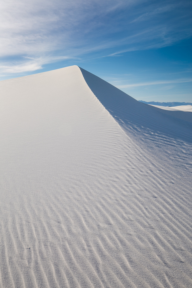 Sand dunes, White Sands National Monument Sand dunes, White Sands National Monument
Sand Dunes and Blue Sky, White Sands National Park |
Blue is often associated with cooler temperatures too.
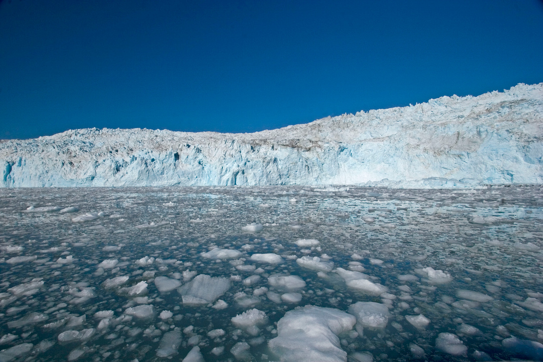 Chenega GlacierPrince William Sound, Alaska Chenega GlacierPrince William Sound, Alaska
Iceberg, Prince William Sound, Alaska |
Because of this, you can use blue tones to create the type of feeling you want to convey. Bright blue skies can translate into happiness while dark and rainy blue cast can be perceived as loneliness or sadness.
Time of Day
The period of time after sunset and before sunrise is known as the blue hour because the sun has dropped below the horizon and created a blue cast. This can have a real positive impact on your image.
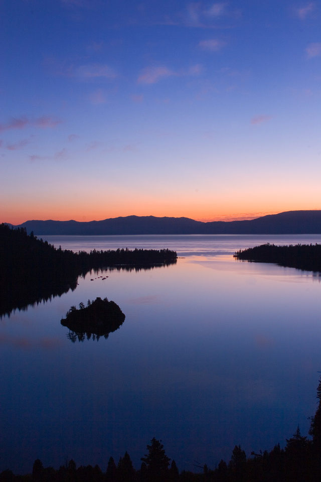 Emerald BayLake Tahoe, California Emerald BayLake Tahoe, California
Dawn, Emerald Bay Lake Tahoe |
The period of time before it gets really dark is twilight and it is an excellent time to capitalize on this type of light. The light is a soft and balanced, which allows all the details to shine through.
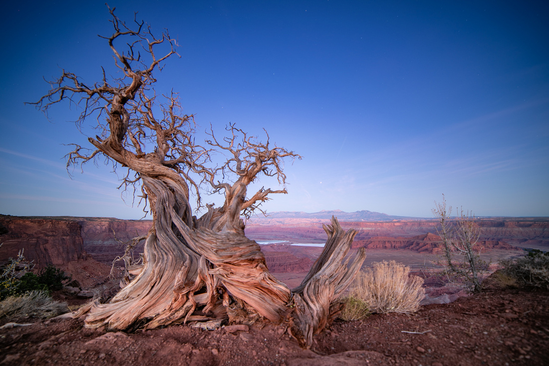
Dead horse Point State Park at twilight |
Complimentary Colors
Orange and blue are opposite each other on the color wheel and compliment each other very nicely as they are the strongest cool and warm hues. This contrast is a good way to emphasize the subject.
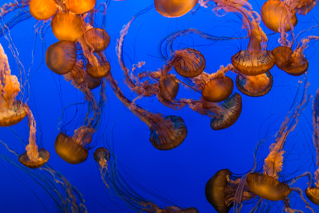 Jellyfish, Monterey Bay Aquarium Jellyfish, Monterey Bay Aquarium
Jellyfish, Monterey Bay Aquarium |
The sky is a great source when looking to incorporate blue into your photos. It's almost always available and contrasts really well against orange rocks and terrain.
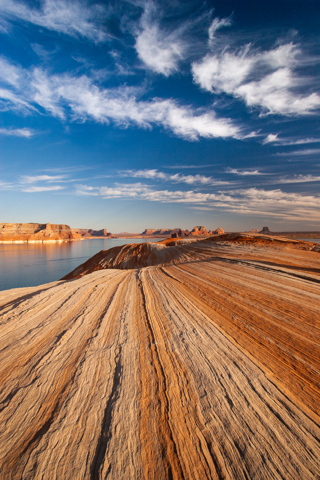
Lake Powell |
Monochromatic Colors
We often think of monochromatic as black and white, but any photo that incorporates one single hue is monochromatic. Using this technique can create a dynamic image because the subject commands all the attention while remaining in balance with the surroundings.
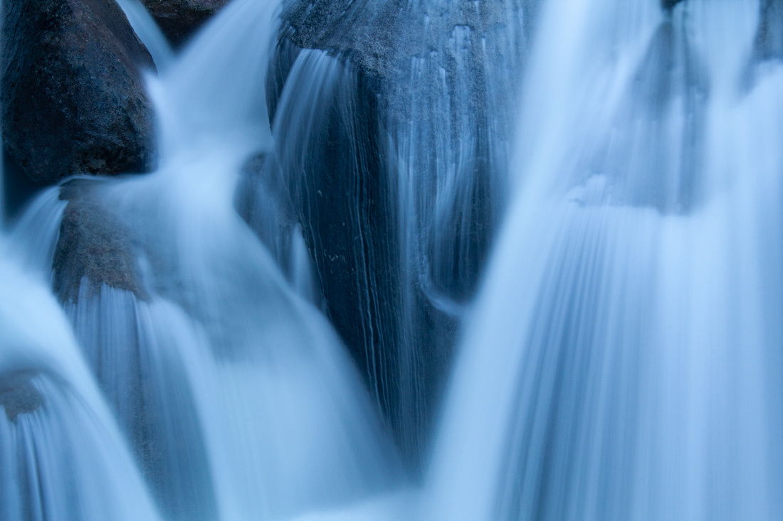 Cascade Creek, Yosemite Cascade Creek, Yosemite
Cascade Creek, Yosemite National Park |
Composition
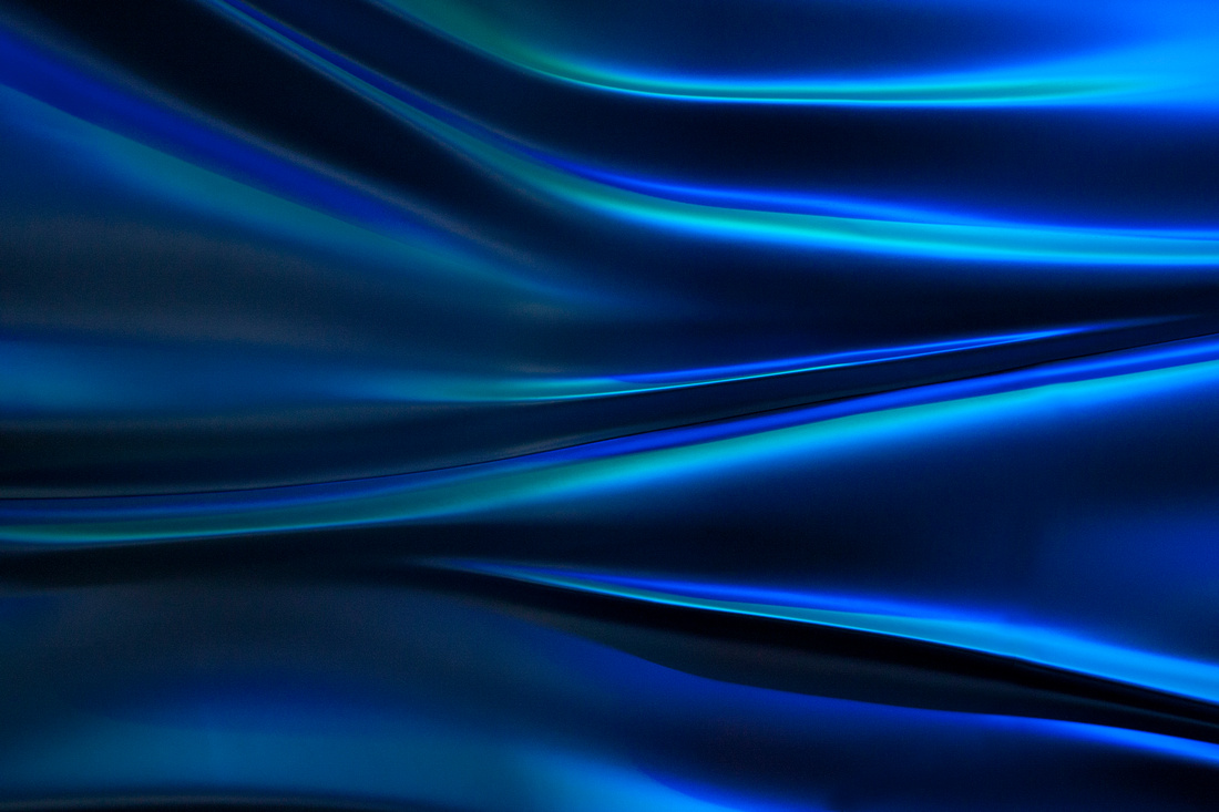
Blue, like all the colors, can be used to create leading lines, natural framing, and patterns.
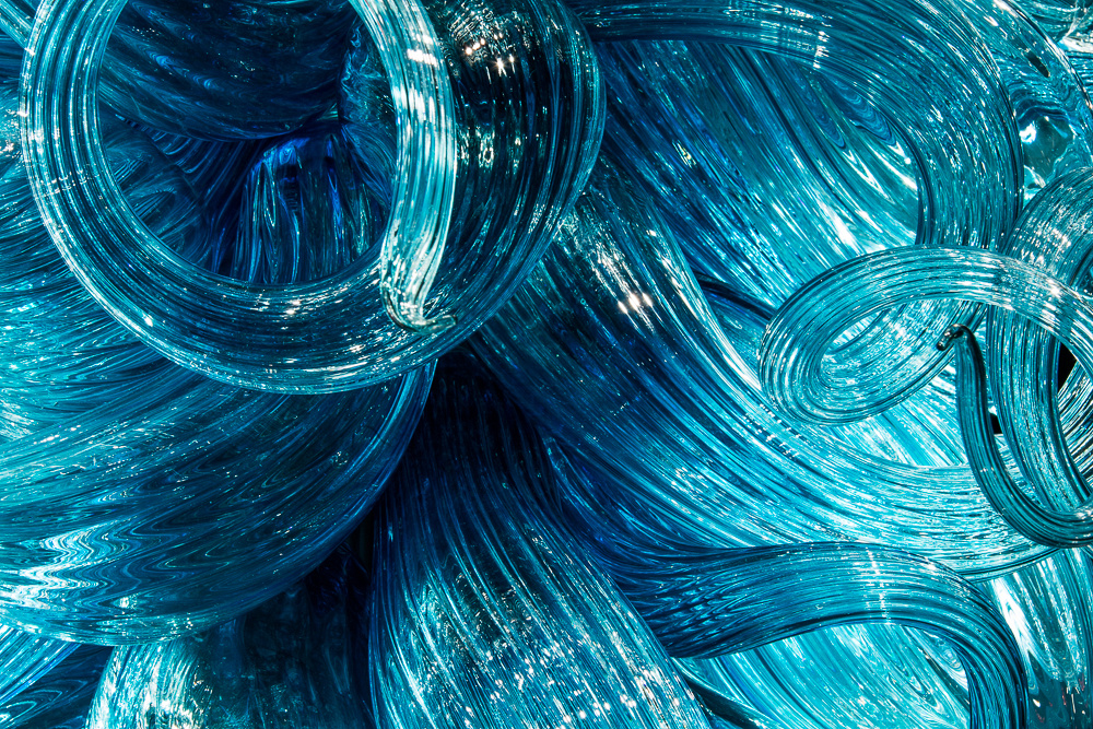 Chihuly glass Chihuly glass
Chihuly glass sculpture |
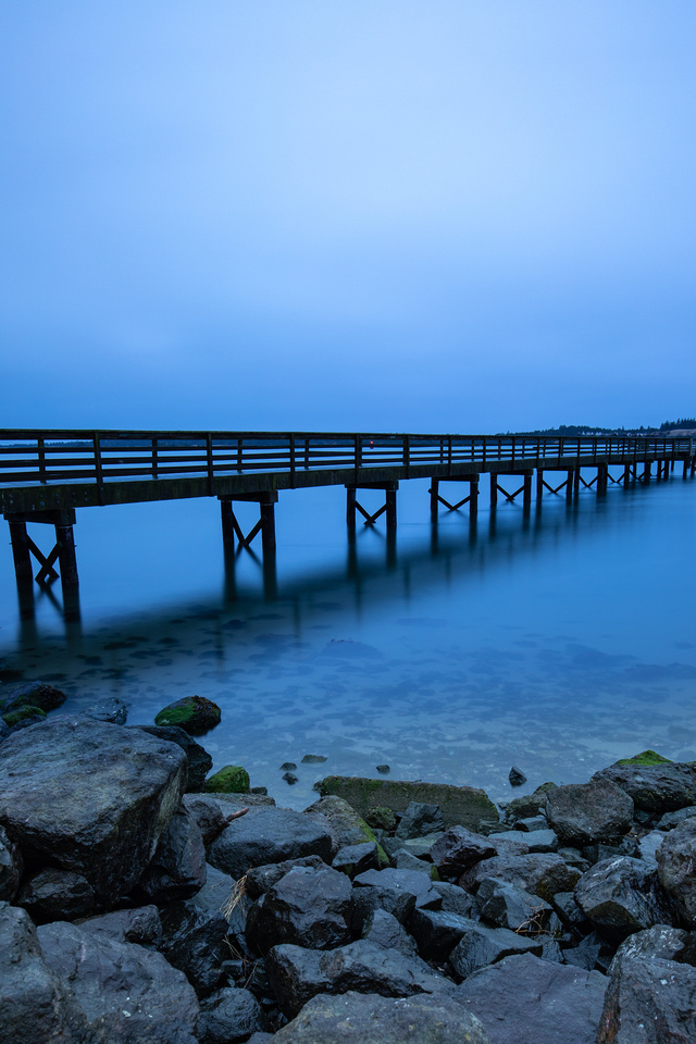
It can also be used to create a sense of depth.
|
Hollering Place Pier, Oregon |
I hope this has given you some ideas for how you can use the color blue to improve your nature photography. To see more images from my blue gallery, click here.

Comments
This url brings up To Good To Be Blue, not the Perfect Sunset???
Truman