Nature Photography as Home Decor
Bring Nature In: How To Incorporate Nature Photography Into Your Home Design
Text and photos by Heather Cline
|
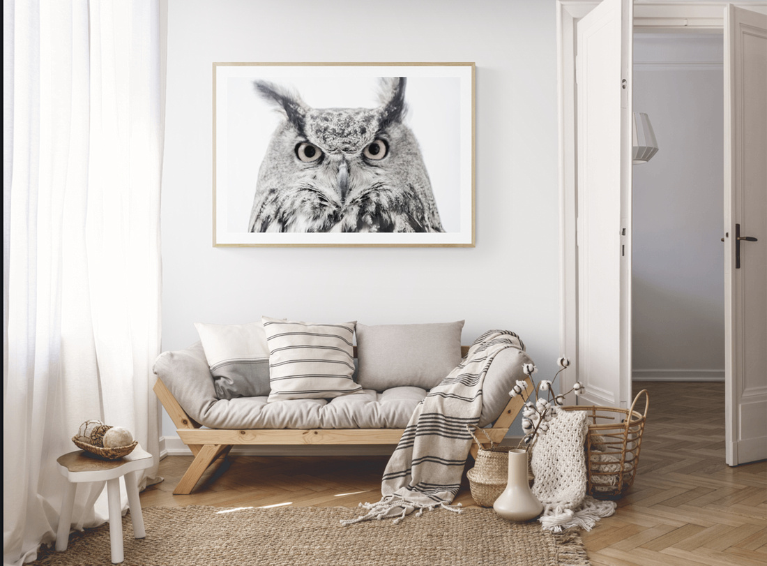
If you have had the pleasure (or pain) of decorating your home, you know interior design helps to create an aesthetically pleasing atmosphere that make home life just a little more gratifying. When decorating a space, we tend to pay a lot of attention to furniture, paint color, and decor, but a large photography print can transform a room as well. A large, stunning nature photography print draws people in and can momentarily take you to a different place.
When choosing a print, the goal is to create a focal point in the room and this article will take you through the different aspects of incorporating nature photography into your home design - to elevate your space and bring nature inside.
Color
Without getting deep into color theory, it has been established in art and design that some colors work well together, while others do not, and this is known as color harmony. The basic colors used to determine color harmony are the triad: red, yellow, and blue on the color wheel. These colors can be mixed in various amounts to create other colors. There are six types of color harmony, but for purposes of this article, we will cover three:
- Analogous: composed of a root color complimented by two or more colors that are all next to each other on the color wheel. For example red, red-orange, orange.
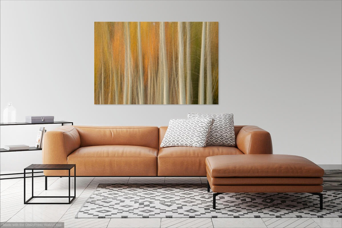
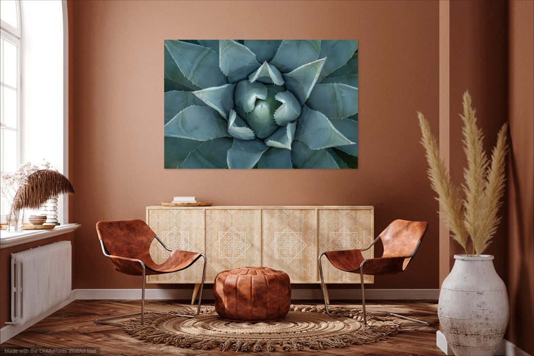
- Complementary: colors that are opposite each other on the wheel, and create the most contrast. For example: blue and orange.
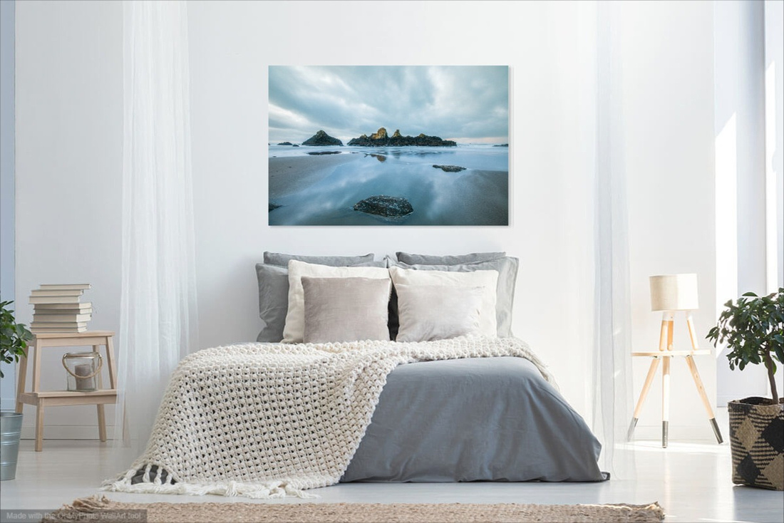
- Monochromatic: the tones, tints, and shades of a single hue. For example: light, medium, and dark green.
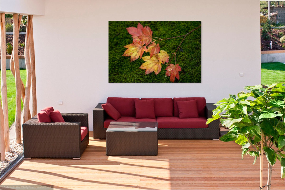
If your space is already filled with furniture of a certain color or color theme, it makes sense to choose a photograph with colors that compliment those already present. After choosing artwork, you could also supplement with accessories that tie into the colors of the photo which creates a unified and cohesive look.
An alternative is to display a large print that is contains a complimentary color to the room decor, helping it to pop and become a more powerful focal point.
|
Theme
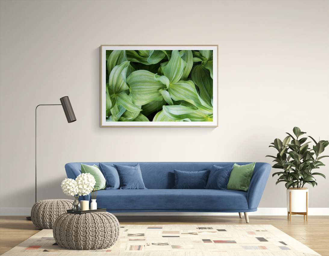
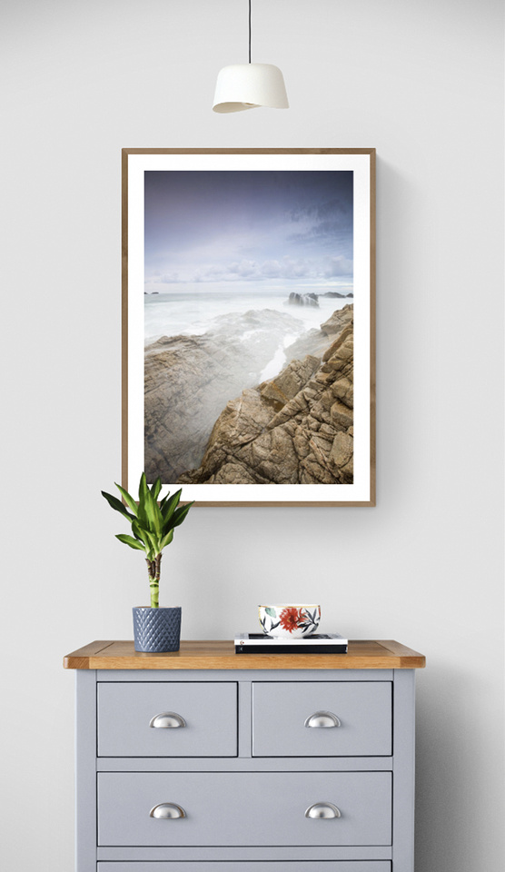
Choosing artwork that matches the style of your home and decor will ensure the photo enhances the space rather than competing with it. If your style is modern, you may opt for a frameless print with architectural subject matter. On the other hand, if your home has a lot of natural elements like wood and stone, a framed photo of a landscape or wildlife might make more sense.
|
Scale
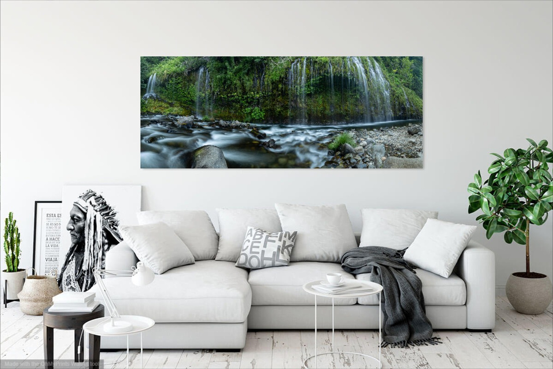
A common mistake when purchasing art is selecting a piece that is too small for the wall. If the wall space is large and it doesn't fit the scale, it will look out of place or become overlooked which is exactly the opposite of what it should accomplish. One single large print makes a powerful statement when a viewer enters the room. They are especially eye-catching when placed above a large piece of furniture like a sofa or dining table.
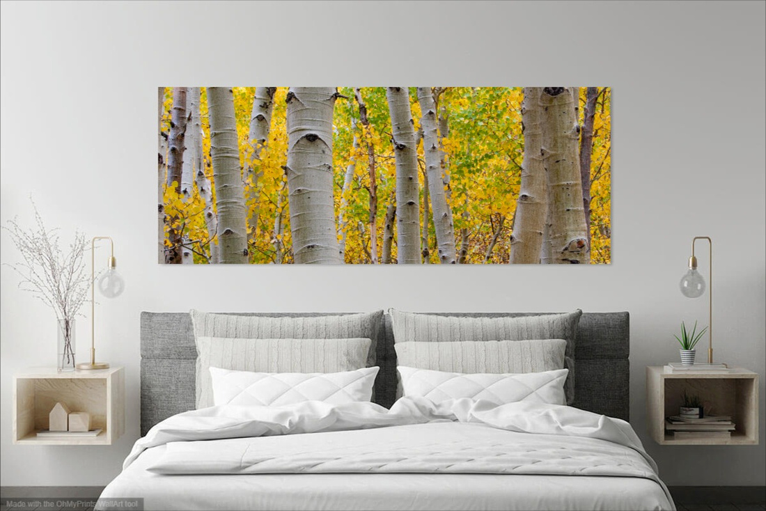
Before purchasing artwork, it is a good idea to determine how much wall space you will be working with and the size of furniture it will be above. Measuring the width of the furniture that will be below the print will provide a good starting point. Artwork placed above a large piece of furniture, such as a sofa, dining room table, or headboard looks best when it is around 2/3 to 3/4 the width of the furniture.
|
Grouping
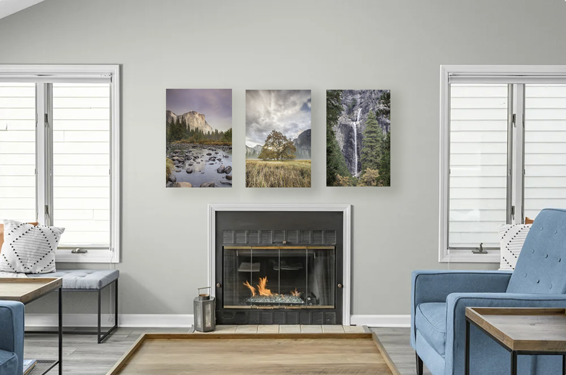
If you find that the wall is too large for a single art piece, you can group a selection of smaller pieces together, creating a galley wall. Prints with a similar theme, color scheme, or both work especially well. However, those that contain different types of landscapes, such as a desert landscape and a mountain landscape don't look as cohesive.
Depending on the wall size, you can group as many prints together as you like but large groupings tend to be overwhelming and defeat the purpose of creating an impactful statement. The sweet spot is around 2 to 5 prints in a grouping. The power of three is a compositional rule in photography and it applies to displaying groups of those photos as well.
Don't overlook abstract images when grouping based on a theme. Patterns and textures can work especially well as a unified subject matter.
|
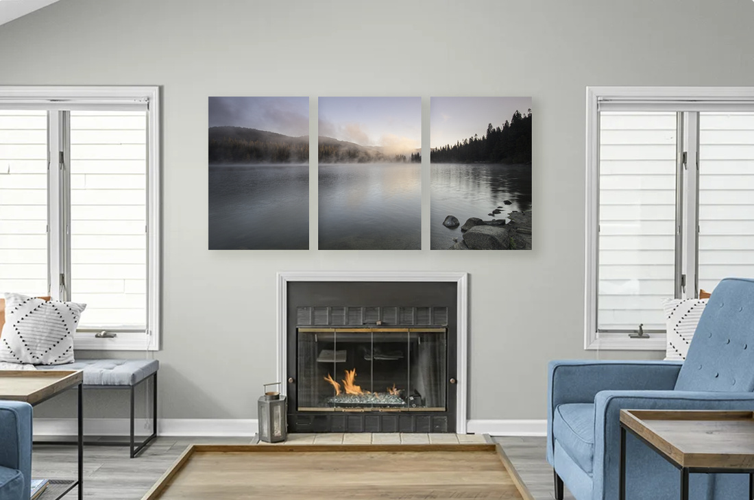
Another form of grouping is a triptych, where one image is split into vertical or square panels and displayed next to each other. This is a personal choice but can work just as effectively as one single large print.
|
Orientation
Another component to consider when curating photography for an interior space is the print orientation – horizontal or vertical. Visually, it is more appealing if the image matches the orientation of the wall. If the wall is wise, a horizontal or panoramic print will appear more natural than a vertical print. Conversely, if the wall is narrow, a vertical will blend in more seamlessly.
|
One exception to this is when the artwork sits above a piece of furniture of a similar shape, such as a sofa. In this case, the image compliments the furniture and vice versa.
|
A love of nature is a common trait most humans share. For this reason, it is no surprise that we are drawn to nature photography to enhance our living spaces. Choosing a color and theme helps set the tone for the space and will create a more pleasing atmosphere for you to enjoy every day - and finding original pieces of artwork is easier then ever so if you have ever thought of decorating your space with a nature photographic print, you now have additional tools to get you started.
