Color me Orange
This is my second blog post in a series on the use of color in photographs. Since we could all use a little happiness, I thought a natural choice for this next post would be Orange. I did a lot of reading about the color orange, what it means in different cultures, how it affects our moods, and what it says about you if it is your favorite color. What I learned is if orange is your favorite color, you are probably the life of the party, which kind of makes sense because anytime I see orange in a photo, it's also the life of the party!
Here's several images that feature the color orange with information on how it improves composition. To see even more orange photos, you can also go straight to my Orange Gallery here.
|
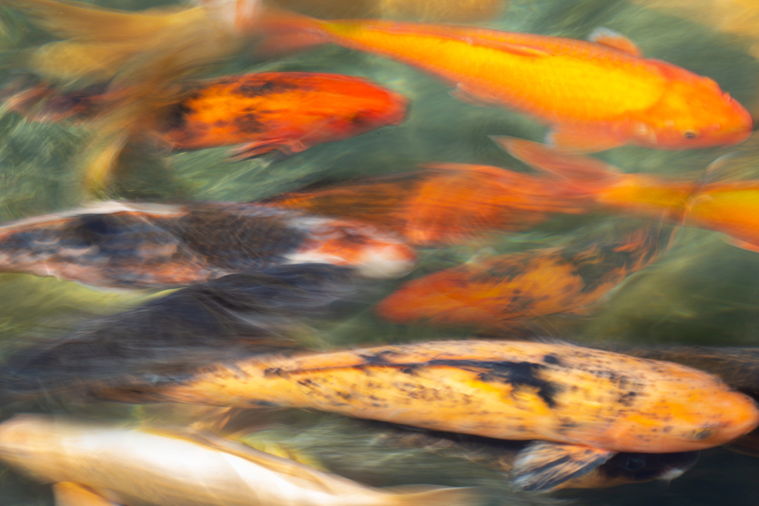
Orange is a color of energy and is a good tool for drawing the viewers attention. Koi are known for their ability to climb rushing streams and waterfalls. I thought capturing their movement was a nice way to way to compliment the energy the color orange portrays. |
|
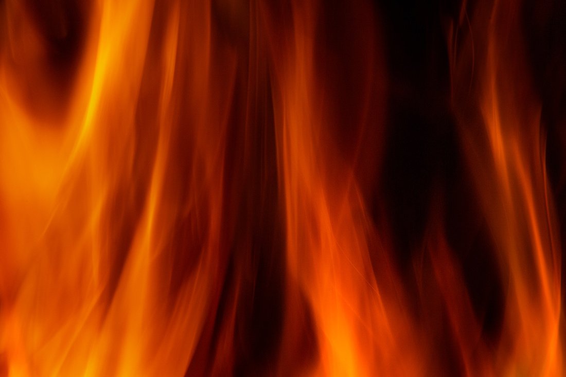
As a prominent color of fire, orange is often associated with heat and destruction and can be used to evoke these thoughts and feelings. I shot these flames while sitting around our firepit one night. It took a lot of experimenting to capture the flames at the right time. As much as I love roasting marshmallows over the fire, this reminds me of the many wildfires we have been getting California during the summer months. |
|
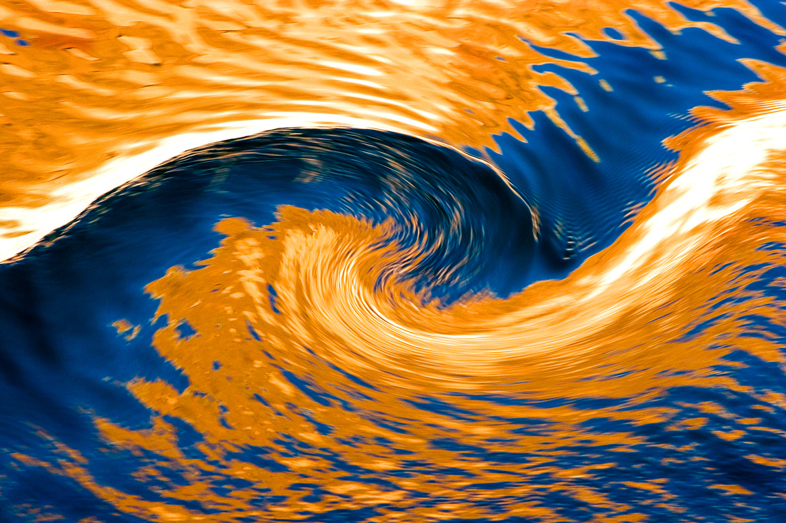
Since blue and orange are complimentary colors, they work extremely well together in photos. In nature, the sky is the most common source of blue so it is a great option if you are looking to create a dynamic composition. There is no shortage of orange when visiting Lake Powell. The canyon walls and blue skies surround you, but capturing a eye popping and unique image is as easy as looking to the reflections in the water. |
|
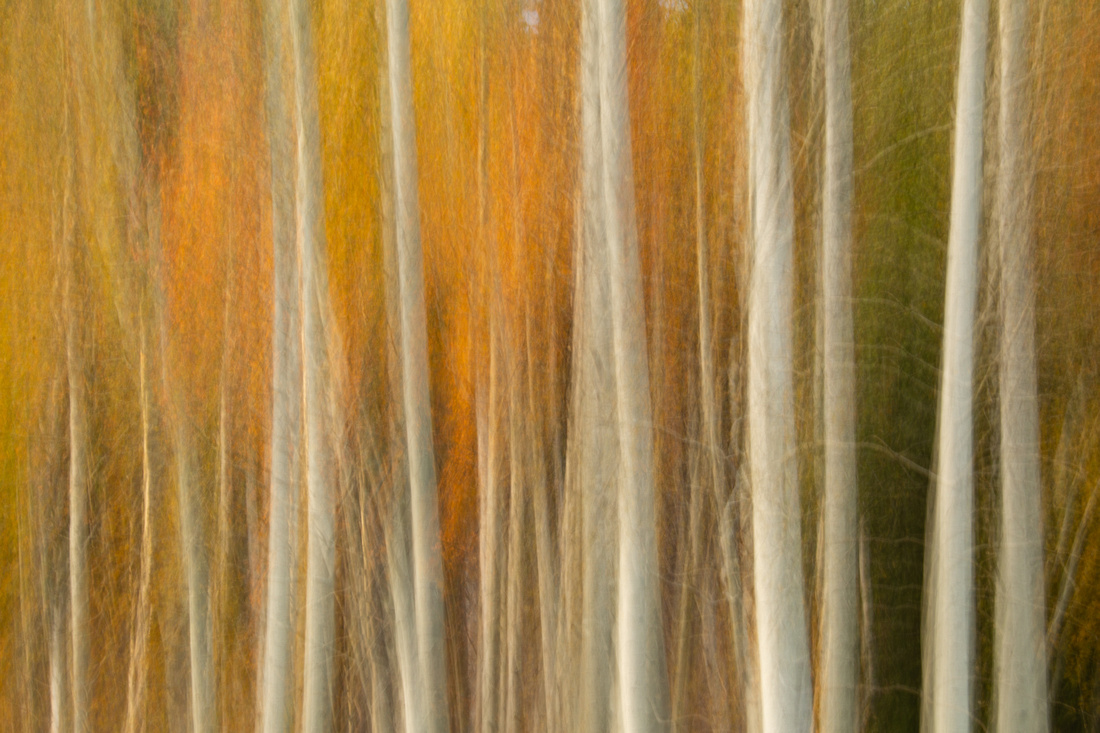
Using orange to create abstract images can be very successful. Look for opportunities to incorporate negative space and/or strong shapes to enhance the composition. We are fortunate in California to get autumn colors from the abundance of aspens in the Sierras. Creating an abstract by moving the camera vertically allows the colors and shapes to stand out in this abstract composition. |
|
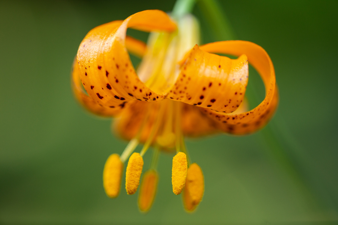
When creating an image with orange, remember that warm colors are dominant so they make for the best subjects, while cooler colors tend to recede into the background. This tint Tiger Lily was complimented by this supporting green background.
|
|
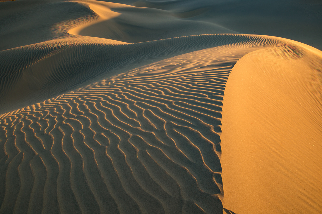
Don't forget compositional rules like "rule of thirds" or "leading lines". Combined with the strong color of orange, you can create a powerful image. Bold colors enhance compositional rules by drawing the viewers eye even more. The dunes in Death Valley provide endless opportunities to put these rules into practice. |
|
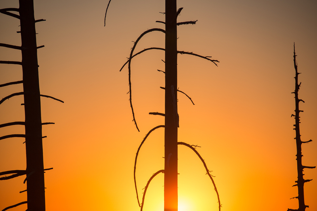
Warm colors are not as common as cool colors, which is another reason they tend to stand out in photos. Aptly named, golden hour occurs during the fleeting moments of sunrise and sunset making them ideal opportunities for photographs. An unexpected image from Yosemite National Park; this is one of my favorites for the simplicity of the shapes and the bold orange color. |
|
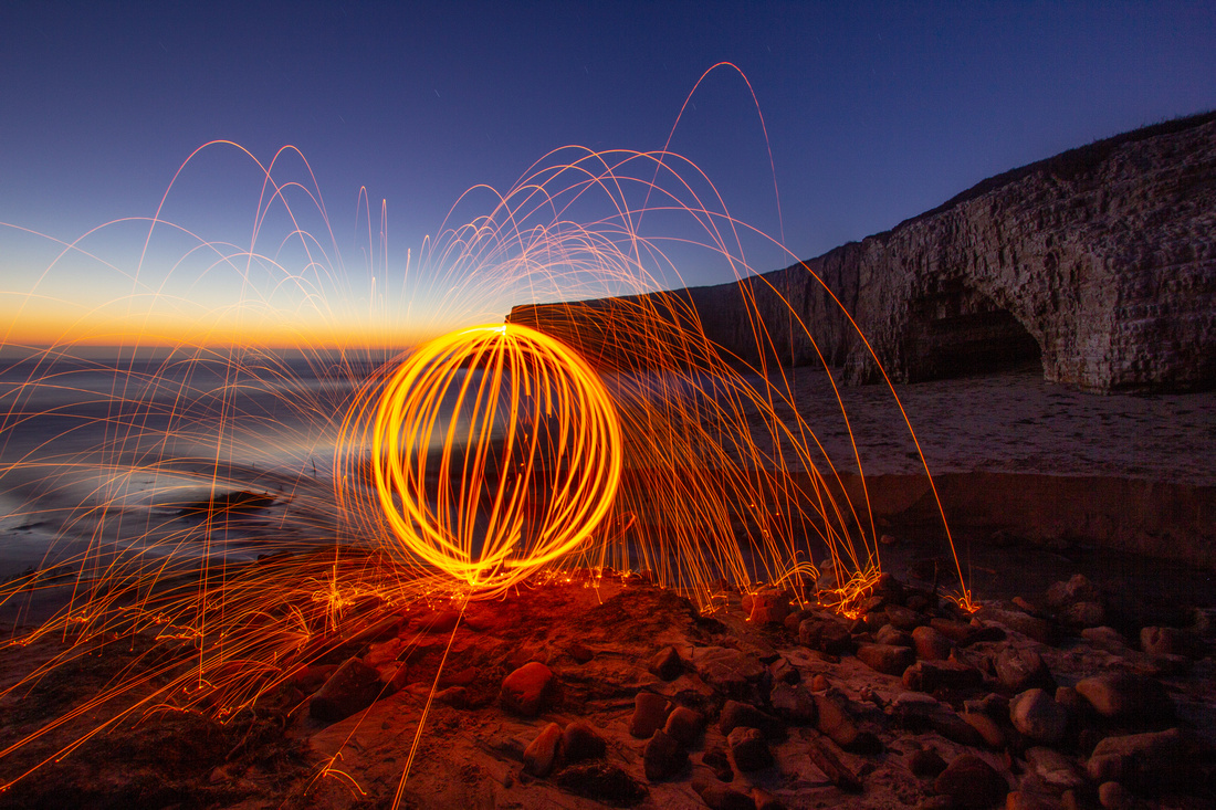
You can create night time compositions that incorporate orange using steel wool and a little patience. This is not an activity you want to do near dry brush or grass as it can be extremely dangerous. The beach is an ideal place to practice creating fire orbs. |
I hope you enjoyed this post. I have a lot more orange photographs to share. You can see more of them in my gallery: Orange.
To see the first post in this series, on the color red: check it out here.

